
FitGO
about.
FitGo approached me as a freelance designer with the goal of building a logo that communicates energy, progress, and motivation. The challenge was to design a visual identity that was minimal yet dynamic, speaking to a modern fitness audience that values both performance and inclusivity.

challenge.
FitGo needed a unique identity in the crowded fitness space, where logos often looked repetitive and lacked emotional connection. The challenge was to design a logo that felt modern and energetic, yet meaningful — a mark that could represent fitness not just as physical training, but as a lifestyle of growth, resilience, and inclusivity. The design also had to be versatile enough to work across social media, merchandise, and promotional platforms.

result.
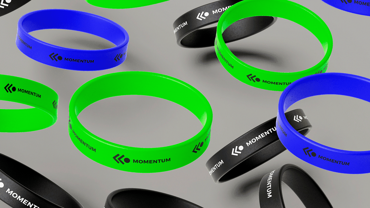
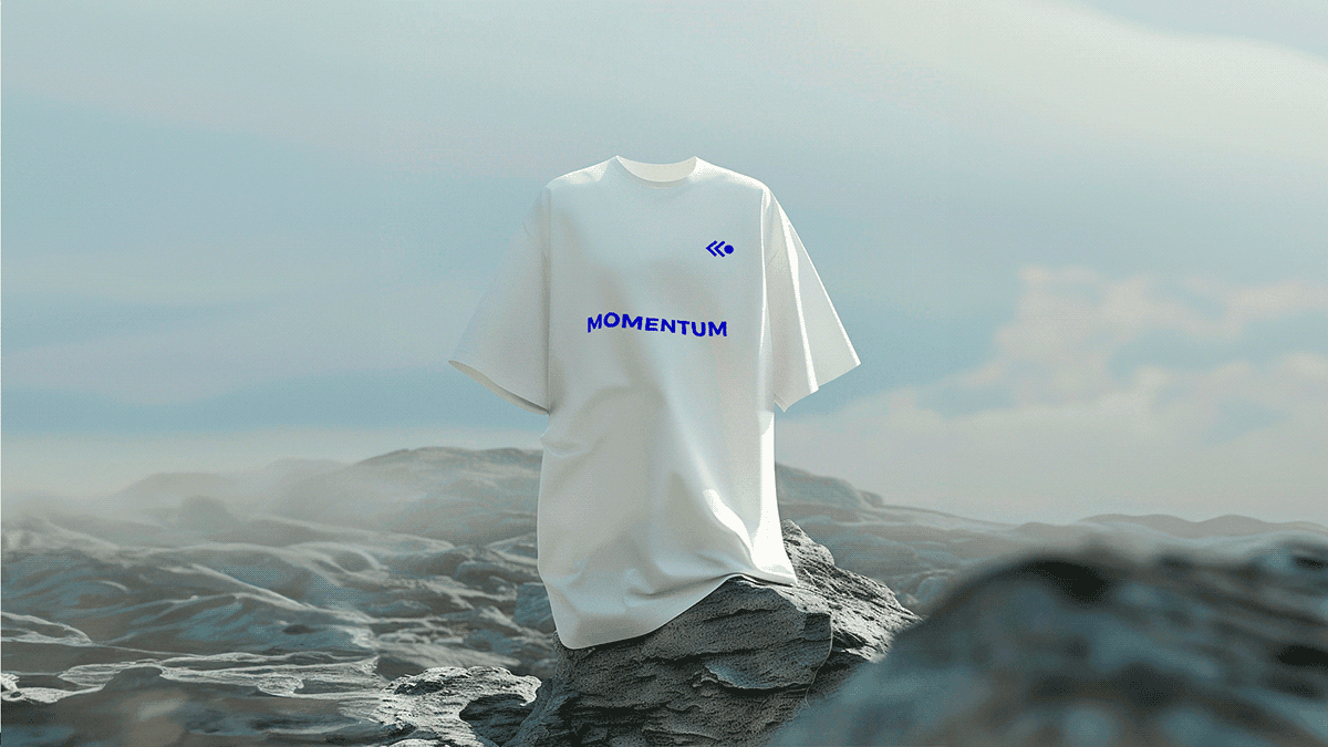
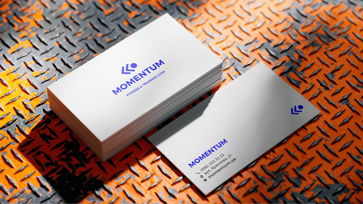
The final logo delivered a bold yet fluid identity that communicates both strength and movement. Through clean typography and a vibrant, dynamic color palette, the design reflects progress, motivation, and energy. Its adaptability across digital and physical applications ensures consistent brand presence, while its symbolic meaning helps FitGo stand out as more than a fitness service — it becomes a community that inspires people to push forward and embrace a healthier lifestyle.
testimonial.
Fit Go blends simplicity and depth, with fitness features adding originality and modernity a perfect touch for abstract beauty.

Koushik Bommera
Chief Engineer

